UX Design • Enterprise Software
Echo Global Logistics
Unifying workflows across legacy platforms to improve efficiency for supply chain professionals.
Unifying workflows across legacy platforms to improve efficiency for supply chain professionals.
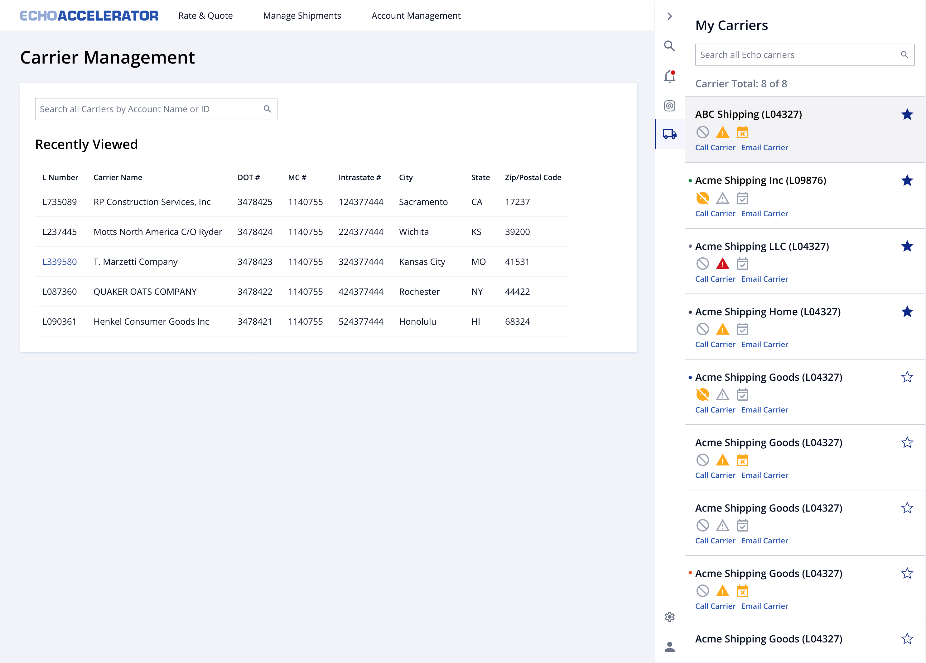
Echo's carrier teams relied on three disconnected legacy tools (Clutch, Optimizer, and STATS) to do a single job, and none of them shared data automatically. I led the redesign of a unified carrier profile that consolidated contacts, load history, compliance, and equipment data into one interface used daily by Directors, Managers, and Reps.
Every carrier task meant working across three systems that never synced, and none of them agreed on what was current.
Carrier Reps and Compliance Reps pieced together their work across multiple systems and external platforms that didn't talk to each other. Contact information lived outside the platform, carrier performance and load history were hard to see at a glance, and profiles went stale fast enough to undermine accurate capacity matching. Compliance was tracked manually, which meant operational risk sat in spreadsheets instead of surfacing where anyone could act on it.
“There's a lot of different places where you need to do one thing to do another.”
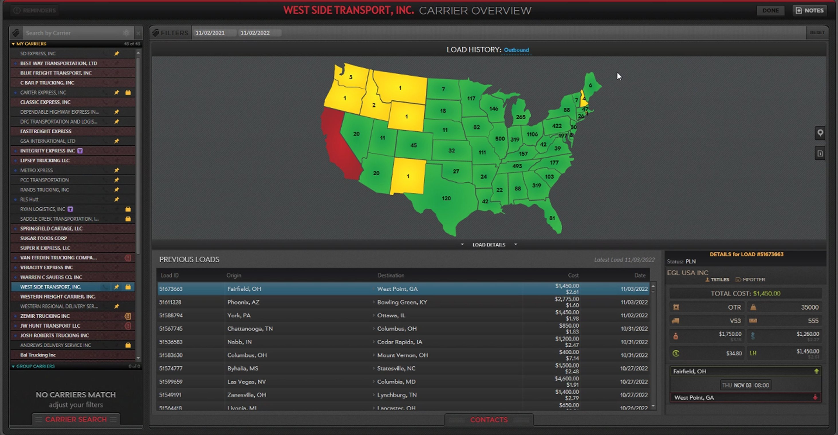 Clutch
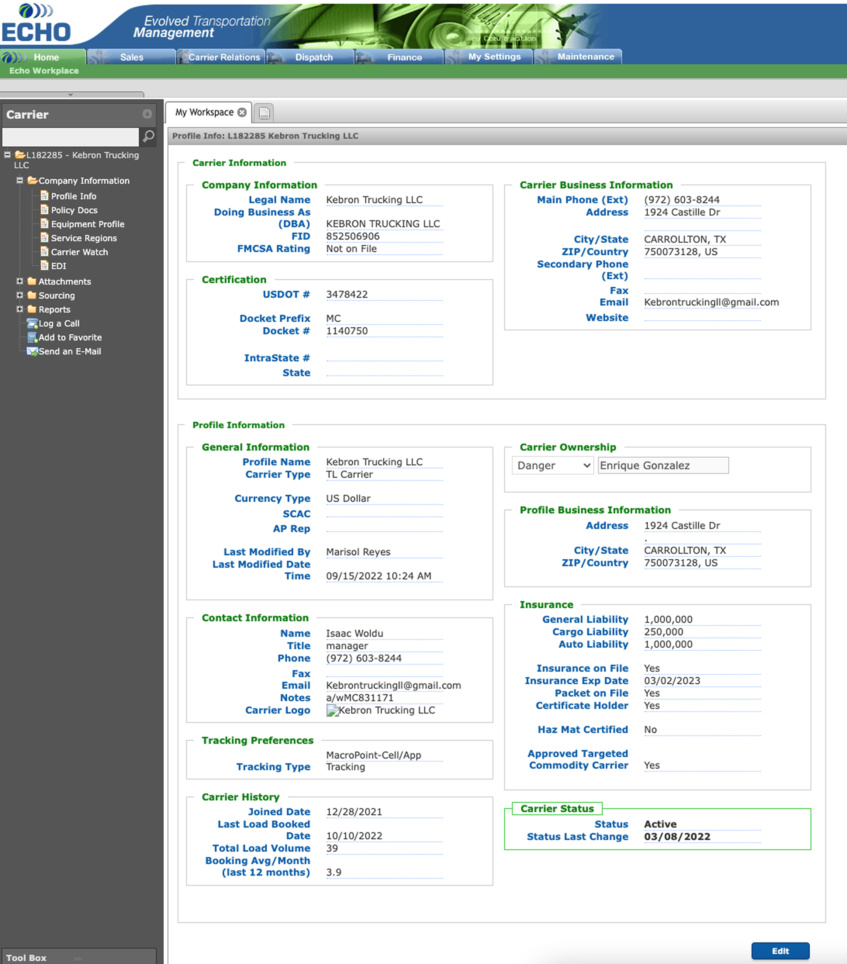 Optimizer
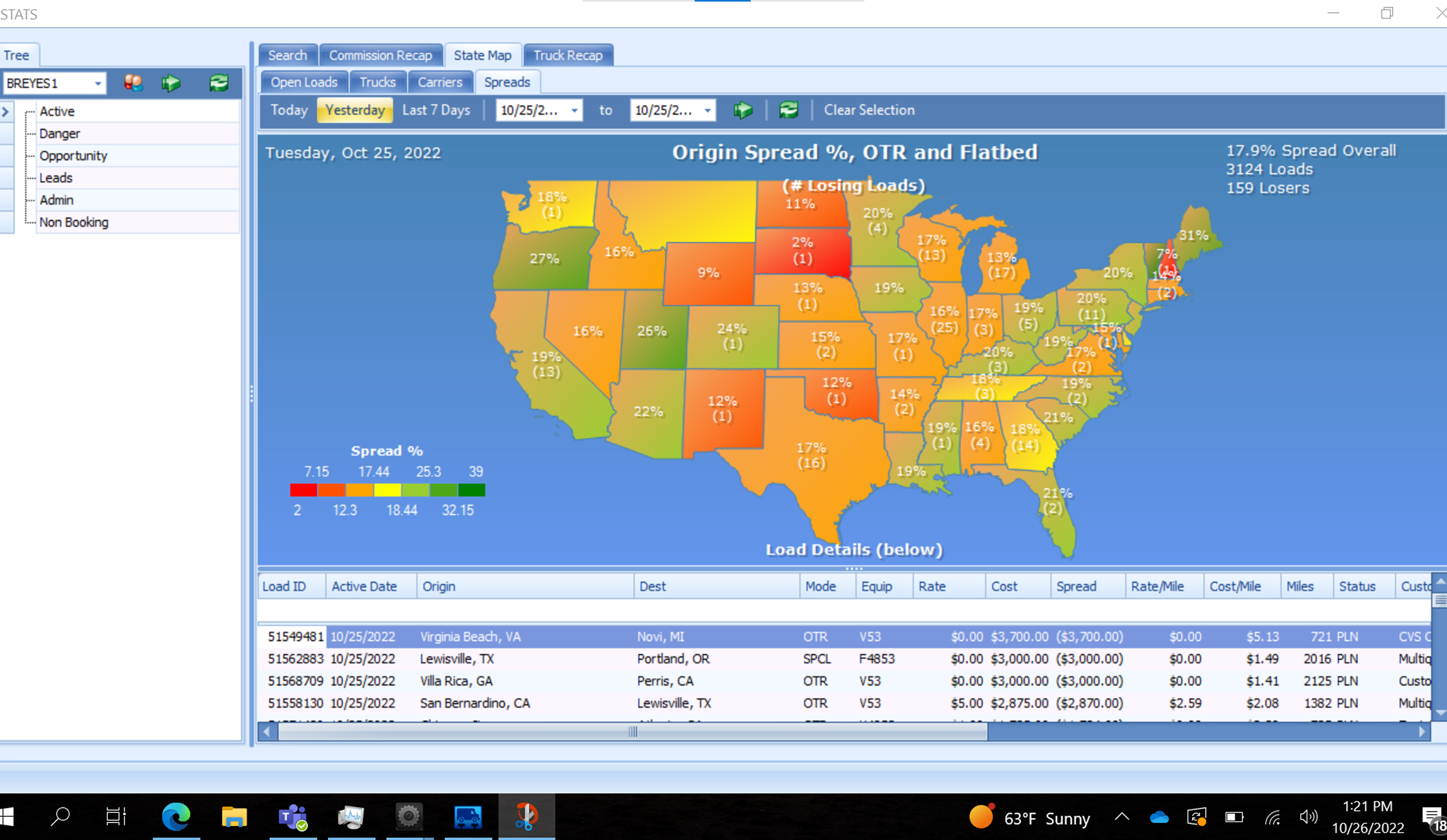 STATS
STATS
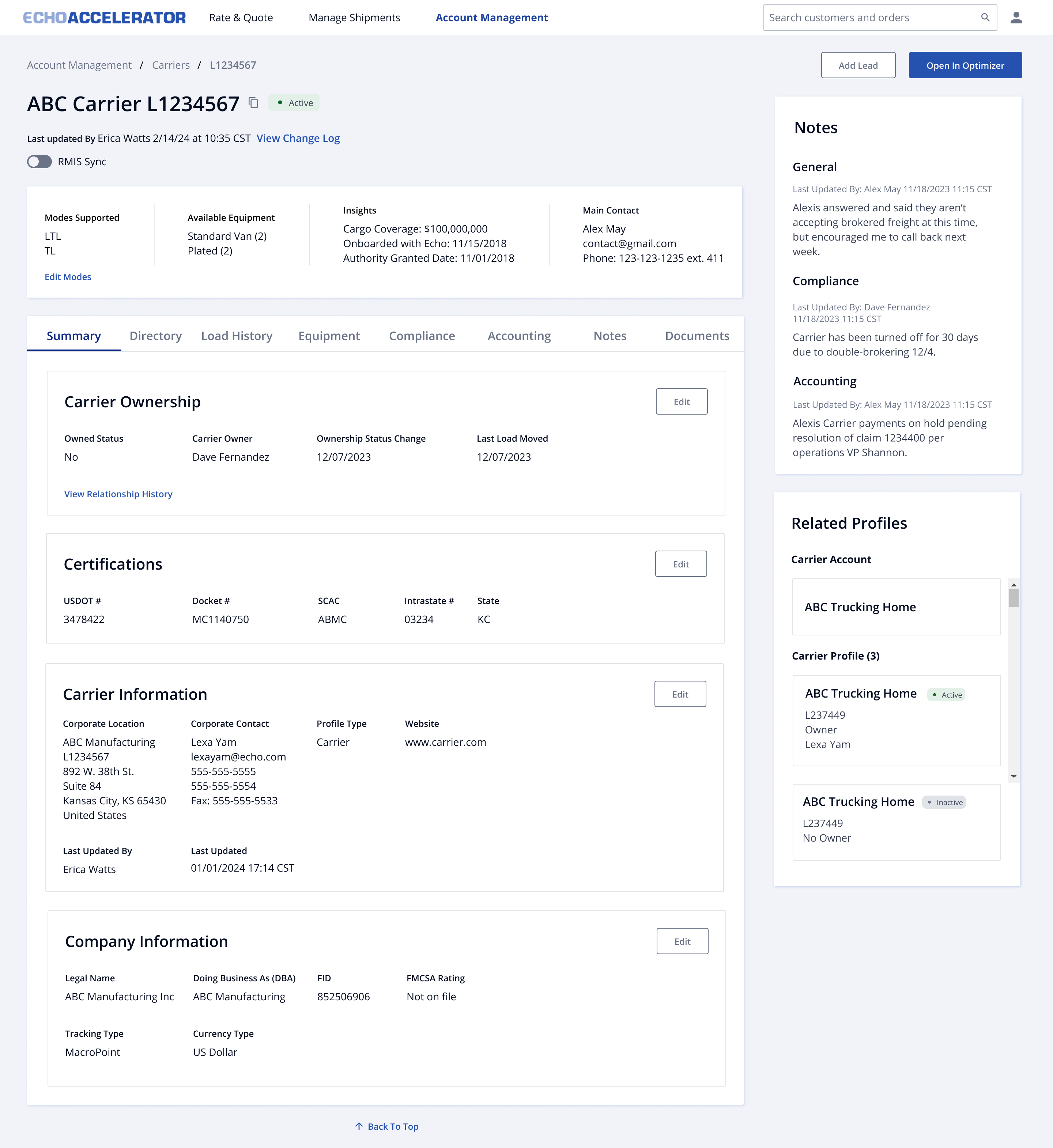
A closer look at the solutions that improved efficiency and user satisfaction.
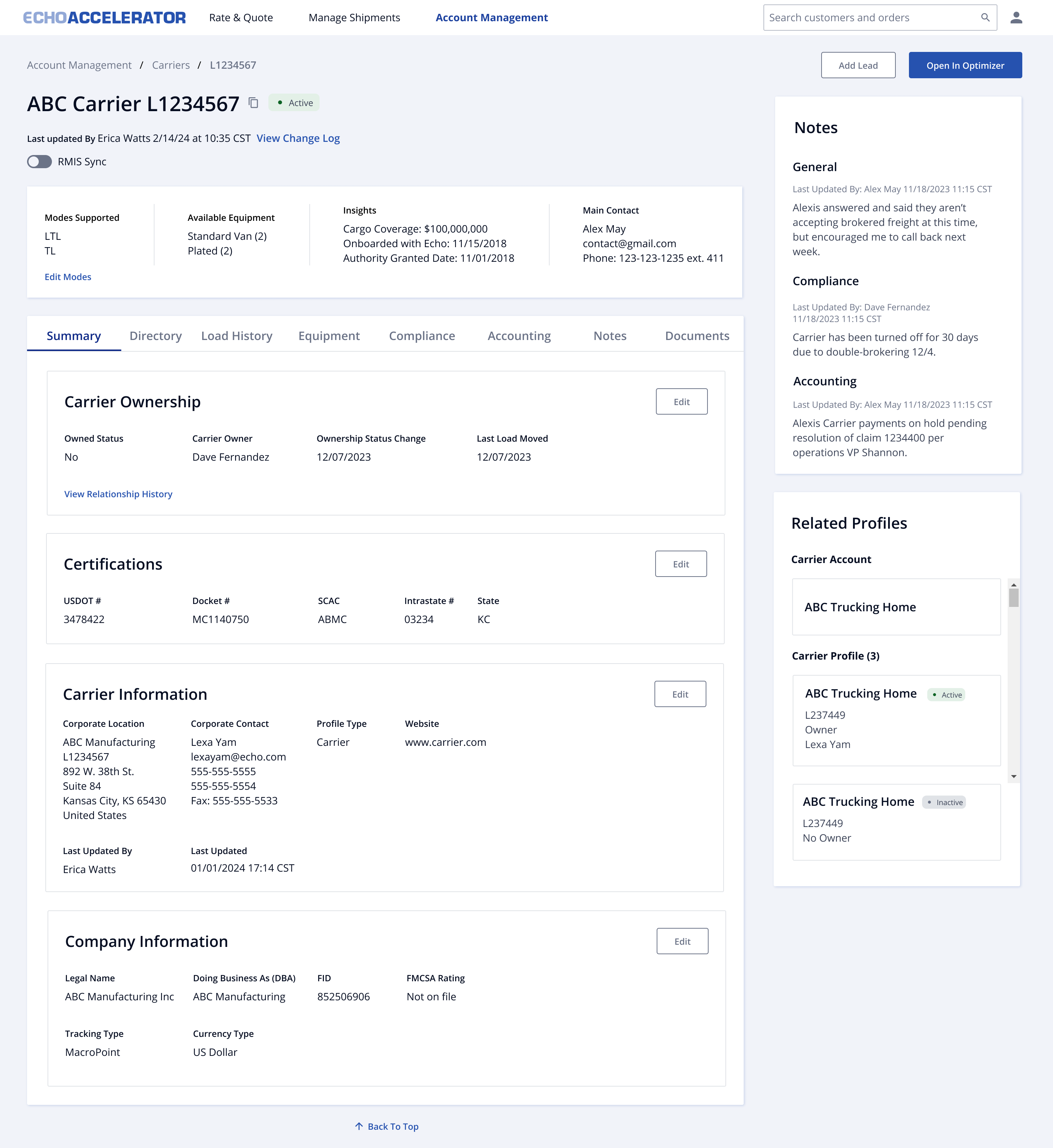
Summary Dashboard. Research kept pointing to a single view, carrier status, activity, and relationships surfaced up front instead of buried behind five separate tabs.
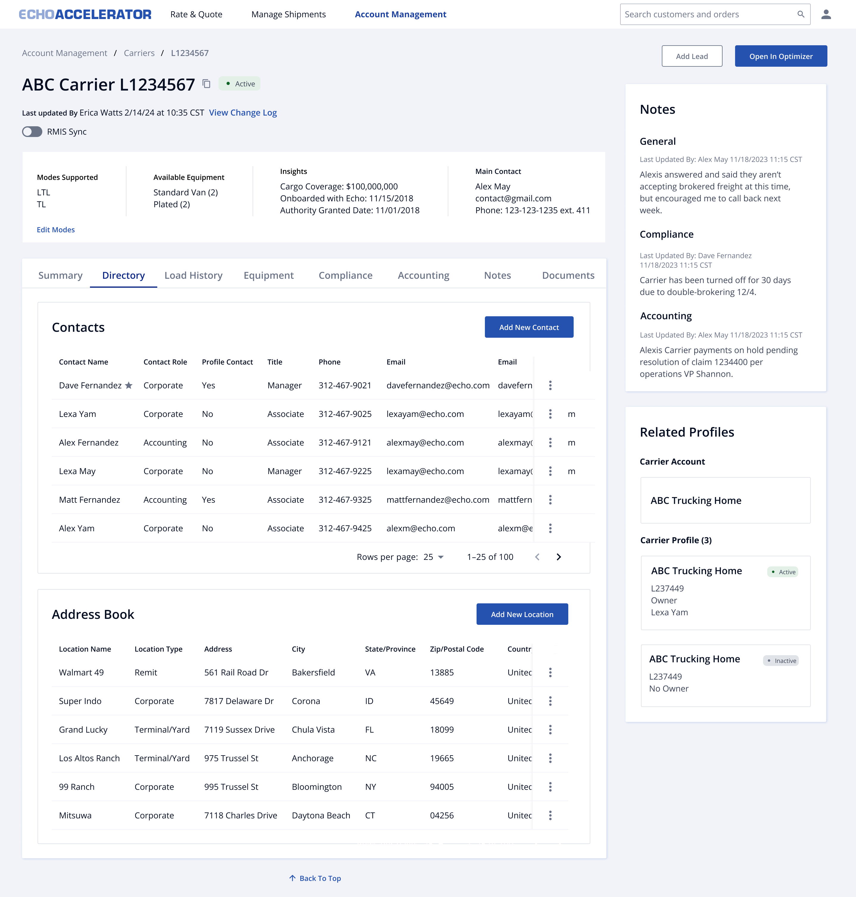
Contacts & Address Management. Role-tagged contacts and categorized addresses replace the undifferentiated list that made "who do I even contact for this?" the top complaint in research.
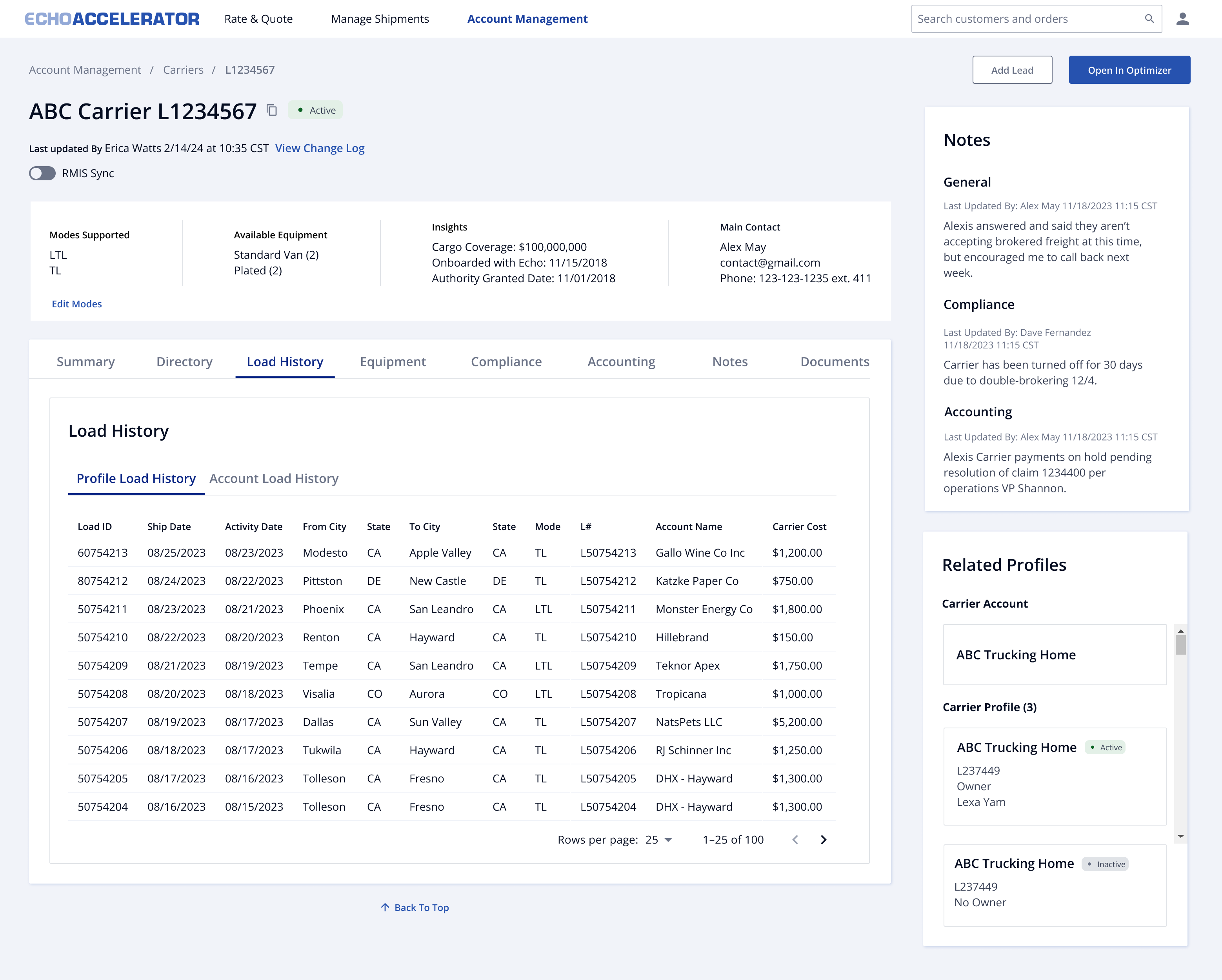
Load History & Performance. Completed shipments and service trends visible at a glance, closing the gap that made capacity matching slower and less reliable than it should have been.

Compliance Management. Dynamic status indicators and exception flagging catch expiring insurance automatically. That's the exact gap that cost Echo a carrier relationship in research.
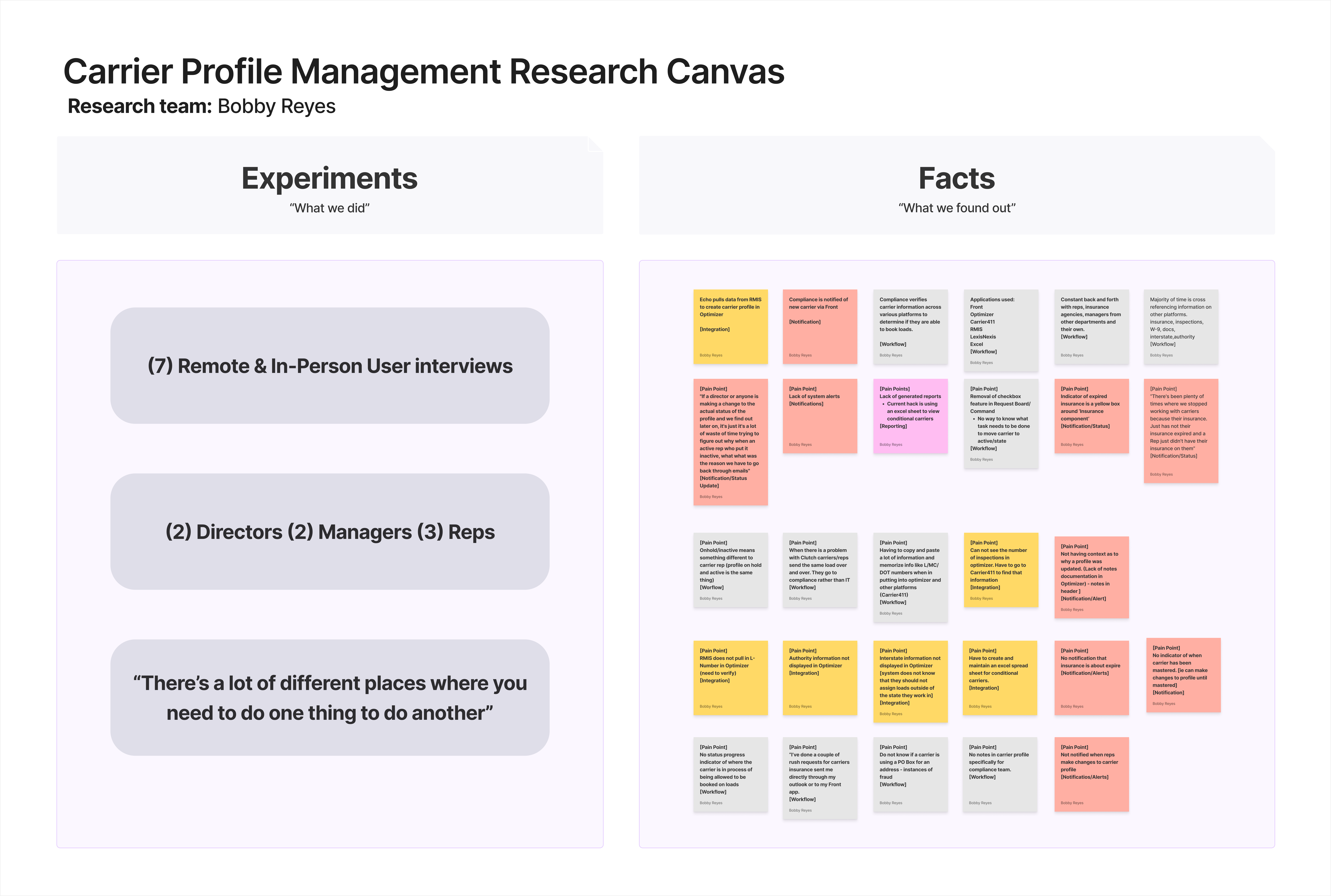
I ran seven interviews across the teams closest to the work: two Directors, two Managers, and three Reps, split between remote and in-person sessions.
A pattern emerged quickly. Every role needed data that lived in a system they weren't currently working in, which meant constant manual cross-referencing just to answer basic questions. Compounding that, there was no proactive alerting for critical events like expiring insurance, so risks were only caught after the fact, or missed entirely.
“We stopped working with carriers because their insurance expired and a rep just didn't have it on them.”
Interview participant Carrier Operations RepBy the time research wrapped, most teams had already built their own workarounds (Excel trackers, personal email threads), a clear sign they no longer trusted the system to do the job.
Round 1 started as a slide-over drawer at the carrier list level, a lightweight v1 that seemed like the faster build, working from the basic profile data our legacy platforms exposed and the two-way sync a full profile page would require with our legacy Optimizer tool. The insight that actually changed our direction wasn't technical, though. It was that stakeholders wanted the complete profile experience, not something rolled out in small iterative pieces. That's what pushed us to build the full page rather than keep iterating on a drawer.
Round 2 replaced the drawer with a dedicated page, but reused a flat-stack pattern already built for customers. Carrier profiles had never been designed before, so it was the fastest starting point, not necessarily the right one. Testing showed it hid information reps needed to see at once, like recent notes or which profiles sat under a carrier account.
That last gap mattered more than it sounds. Echo was introducing a new hierarchy (Logistics Provider, then Carrier Account, then Carrier Profile), and the old tools had no way to represent it. Multiple carrier profiles could exist under one account with no visible relationship between them, which meant Compliance couldn't trust that a change made on one profile was reflected correctly across related ones, and duplicate accounts crept in as a result. The final round's Related Profiles panel was the first surface for that hierarchy, letting Compliance see which profiles actually belonged together before acting on any of them.
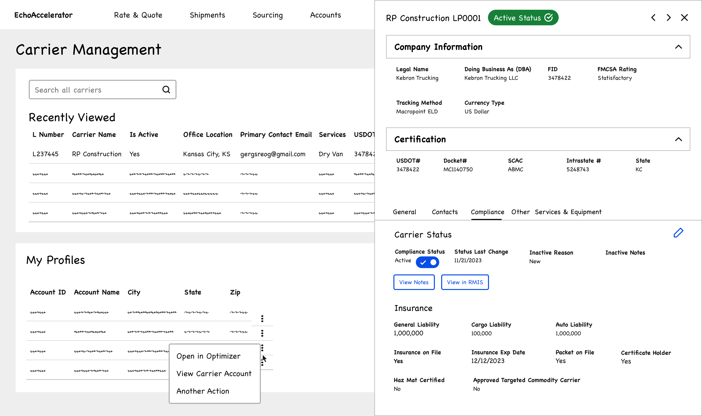
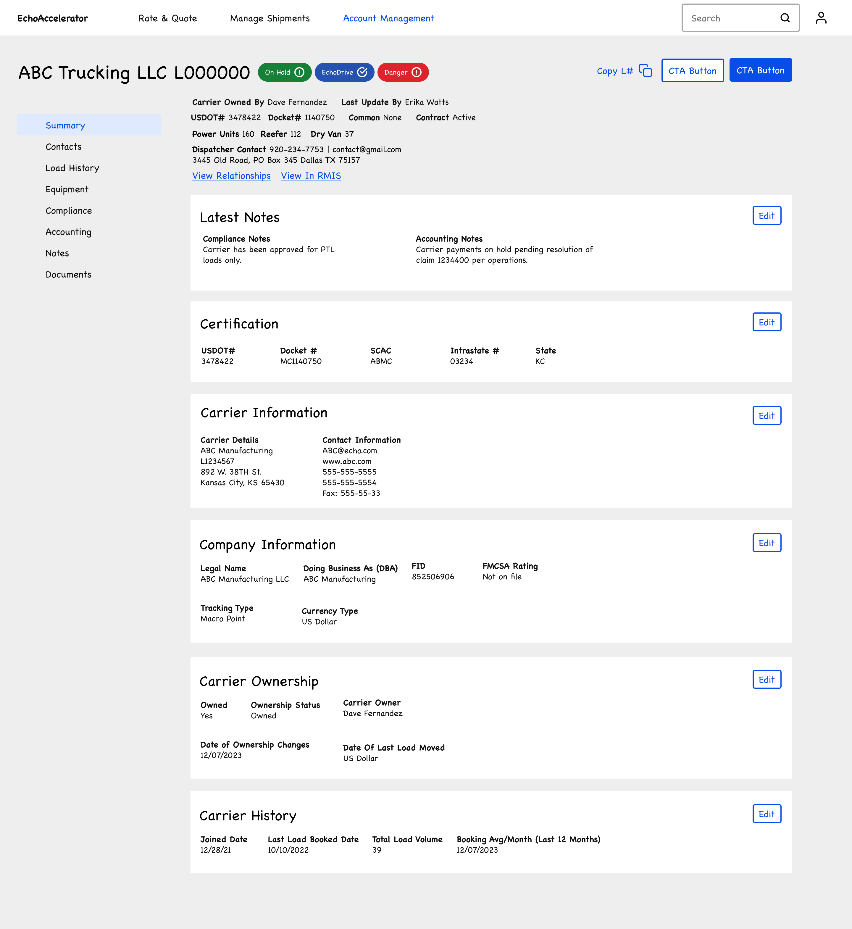
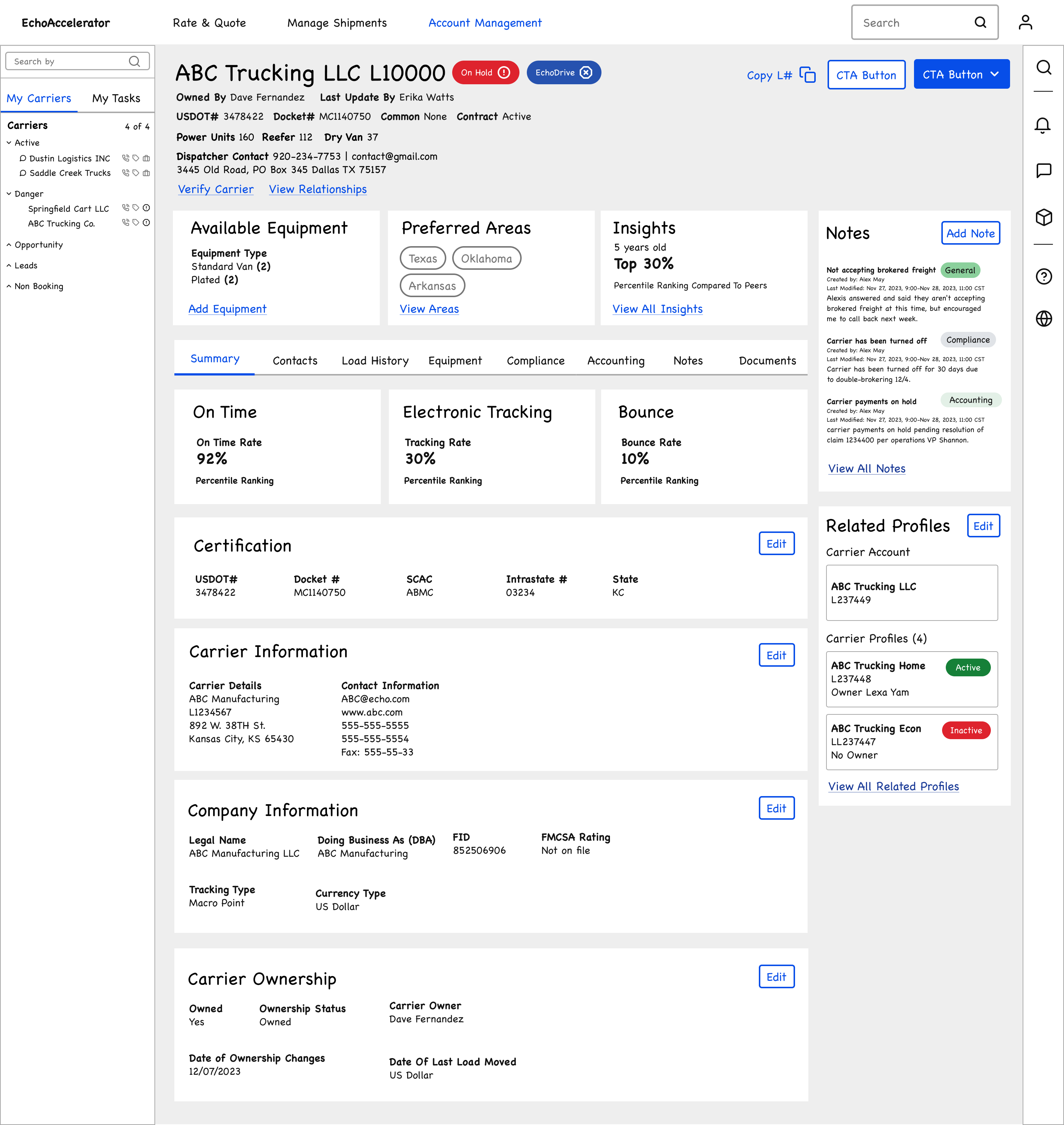
Fig. 1–3: Wireframe evolution to the final structure.
Each pass carried its open questions forward on the wireframes themselves, keeping decisions grounded in research rather than personal preference. Some of those questions stayed open past the final round, including one I still think about: is this the right placement for viewing preferred lanes?
Consolidated summary cards. Key metrics and relationships now live directly on the main view instead of behind separate tabs, because people needed to verify a carrier's status before acting, not after digging through five tabs to find it.
Role-tagged contacts. Pairing role labels with address types replaced an undifferentiated contact list and solved the single most common complaint from research: "who do I even contact for this?"
Automated service areas. Equipment and lane data now pull directly from source systems instead of relying on manually maintained profiles, exactly the kind of stale data that had been quietly breaking capacity matching for years.
Cut the performance score cards. On-time rate, tracking compliance, and bounce rate tested well as a concept, but the algorithm behind them wasn't defined yet, and we couldn't get alignment on how to calculate it. Shipping an inaccurate number felt riskier than shipping none. It's still on the roadmap, and getting it right would help reps make faster judgment calls on which carriers to work with.
The clearest signal of success wasn't a metric. It was behavior. Carrier reps and compliance reps chose the new unified profile over falling back to the old three-tool workflow.
Clutch, Optimizer, and STATS are still running and scheduled for sunset, so switching back was always one click away. Teams didn't take it, which says more about whether the redesign actually solved the problem than a dashboard number would have.
What I don't have is the analytics to quantify that shift precisely. Echo didn't have instrumentation in place to track it. Pushing for that measurement layer is one of the things I'd prioritize next.
If I were defining that measurement layer today, the metric that actually tests the thesis is the Optimizer fallback rate. That's the share of carrier work reps still complete by clicking back into Optimizer instead of staying in the unified profile. The button and the Split flags are still live specifically so that fallback is possible; watching that rate collapse toward zero is what would tell us the profile really closed the gap, not just that people used it.
The biggest lesson here wasn't about the interface. It was about not trusting a pattern just because it already exists. Reusing the customer profile layout for carriers felt efficient at first and cost us a full round of testing once we realized carriers needed to be designed from scratch. The other thing I keep coming back to is measurement. I pushed for it, but defining success at a company this size, in the middle of a larger TMS overhaul, isn't something one project can force on its own. It's something I want to keep finding better ways to advocate for.
One thing I'd still change: carrier identifiers (MC#, DOT#, Intrastate#) live in the Certifications card, several scrolls down. For someone just trying to confirm a carrier is compliant before booking, that's real friction; surfacing those identifiers higher up, right in the header, would make the fastest, most common check even faster.